Icon Picker Component
An open-source, virtualized icon picker for React and shadcn/ui.
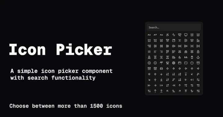
Building user interfaces often requires striking a delicate balance between functionality, performance, and user experience. This challenge became particularly apparent when I needed an icon picker component that could handle large icon sets efficiently while maintaining a smooth user experience. The result is a versatile Icon Picker component built with shadcn/ui, offering different implementations to suit various use cases.
Where the Idea Came From
The concept for this component emerged from a common need in modern web development: the ability to select icons from large icon libraries efficiently. While many existing solutions work well with small icon sets, they often struggle when dealing with hundreds or thousands of icons, leading to performance issues and poor user experience.
I wanted to create a component that would:
- Handle large icon sets without performance degradation
- Provide a smooth search experience
- Offer flexible implementation options
- Maintain a clean, modern aesthetic
Implementation Approaches
The project offers three distinct implementations of the Icon Picker, each designed to address specific use cases and performance requirements.
Basic Icon Picker
The foundational version provides essential functionality with a clean interface:
- Icon grid display
- Search functionality
- Simple selection mechanism
import IconPicker from "@/components/icon-picker";

function MyComponent() {
  const [selectedIcon, setSelectedIcon] = React.useState(null);

  return <IconPicker value={selectedIcon} onChange={setSelectedIcon} />;
}
Virtualized Icon Picker
For handling large icon sets, I implemented two virtualized versions:
-
TanStack Virtual Implementation:
- Uses TanStack Virtual for efficient rendering
- Optimized for dynamic grid layouts
- Perfect for responsive designs
-
React Virtualized Implementation:
- Leverages React Virtualized
- Ideal for fixed-size grids
- Excellent performance with predictable layouts
Popover Variant
The popover implementation combines the power of virtualization with a more compact UI:
import { Button } from "@/components/ui/button";
import { Popover, PopoverContent, PopoverTrigger } from "@/components/ui/popover";
import IconPicker from "@/components/icon-picker";

function MyComponent() {
  const [selectedIcon, setSelectedIcon] = React.useState(null);

  return (
    <Popover>
      <PopoverTrigger asChild>
        <Button>Icon Picker</Button>
      </PopoverTrigger>
      <PopoverContent>
        <IconPicker value={selectedIcon} onChange={setSelectedIcon} />
      </PopoverContent>
    </Popover>
  );
}
Technical Stack
The project leverages modern web technologies to deliver a robust and performant component:
- Next.js: Provides the foundation and development environment
- React: Powers the component’s interactivity and state management
- TypeScript: Ensures type safety and better developer experience
- Tailwind CSS: Handles styling with utility-first approach
- shadcn/ui: Offers high-quality, customizable base components
- Lucide React: Provides the icon set
Performance Considerations
Performance was a key consideration throughout development. Here’s how each implementation addresses performance challenges:
Basic Version
- Suitable for small to medium icon sets
- Direct DOM rendering for immediate interaction
- Efficient search implementation
Virtualized Versions
- Only render visible icons
- Minimal memory footprint
- Smooth scrolling experience
- Optimal for large icon sets
Popover Implementation
- Combines virtualization benefits
- Reduces initial render impact
- Lazy loads content when needed
Future Enhancements
Looking ahead, there are several exciting possibilities for expanding the component’s capabilities:
- Custom Icon Support: Allow users to add their own icon sets
- Multiple Selection Mode: Enable selecting multiple icons simultaneously
- Categorization: Add icon categorization and filtering
- Accessibility Improvements: Enhance keyboard navigation and screen reader support
- Animation Effects: Add smooth transitions and hover effects
- Configurable Grid Layout: Allow customization of grid dimensions and spacing
Conclusion
The Icon Picker component represents a practical solution to a common web development challenge. By offering multiple implementation options, it provides developers with the flexibility to choose the approach that best suits their specific needs.
Whether you’re building a small application that needs a simple icon selector or a large-scale project requiring efficient handling of thousands of icons, this component offers a solution that prioritizes both performance and user experience.
The project is open source and available on GitHub, welcoming contributions and feedback from the developer community. As web applications continue to evolve, components like this demonstrate how thoughtful design and implementation can solve real-world development challenges effectively.